Monday, February 28, 2022

KPI IN EXCEL : Focus on Operating Profit %

 Key performance indicators (KPIs) are visual measures of performance and usually included in reports. Supported by a specific calculated field, a KPI is designed to help users quickly evaluate the current value and status of a metric against a defined target. 

In this blog, we will use Operating Profit % as a KPI since Small and Medium enterprises need to understand that Operating profit is a useful and accurate indicator of a business's health.

Here's how to use KPI in Excel. Open the data "KPI Data" from Github  https://github.com/alcadelina/KPI

Step 1. Open an Excel file. Click on the File tab on the uppermost ribbon. Go to Options.


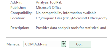
Step 2: Under Options > Click on Add-ins. You’ll be able to see the screen as shown below.


Step 3: Select COM Add-ins under the Manage section dropdown and click on the Go button.


Step 4: As soon as you hit the Go button, the COM Add-ins dialog box will pop up. Select Microsoft Power Pivot for Excel from the list of add-ins and click OK.

After enabling this PowerPivot add-in, you should be able to see the PowerPivot option tab on the topmost panel ribbon in your excel.


Step 5: Under the PowerPivot tab in your excel file, click on Manage.


Step 6: It should open a new tab named Power Pivot for Excel. 
Step 7: Once you click on the “From Other Sources” tab, a new window named Table Import Wizard will pop up. There you can see a lot of options from where you can import the data to PowerPivot. Select the Excel file, then click on the Next button to proceed further.


Step 8: Browse the path on where your excel data file is stored and click the Next button to finish the Import.


Step 9: Click on the Finish button once the data table is loaded into PowerPivot.


Step 10: After a successful import, you will be able to see the data as below.


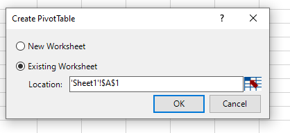
Step 11: Now, in order to create a KPI report, we need to slice and dice our data under the pivot table. Click on the Pivot Table tab under PowerPivot. Once you click it, a new window named Create PivotTable will appear in which you have to select the data from PowerPivot, and it asks you whether you want a pivot table under a new sheet or on the same sheet. I will prefer to go with the same sheet and then will provide the range on which the pivot table should be added. Click OK once done.


Step 12: Select the data under rows, columns, and values, as shown below.


Here we have selected data in the following order:

Rows: Accounting Date Year & Quarter

Values: Sum of Total Sales & Operating Profit

Step 13: Now, we are going to add a calculated column in the pivot. Select Measures under excel sheet. Click on New Measures.


A new window called Measure will pop up. It will allow you to formulate a measure and add it under your pivot table created.


Step 14: Under ” Measure name:”, add a name OPERATING PROFIT %. If you want to add a description for the same, you can add it there as well under the Description section. In this case, Operating Profit Percentage measures how much of a profit the company is generating from their main operations. The operating profit percentage represents the percentage of a company’s sales that ultimately end up as profit. 
Under the Formula section, add the formula =[Sum of Operating Profit]/[Sum of Total Sales] as shown below. It will calculate the OPERATING PROFIT % for you. See the screenshot below.


Above, we have created a new calculated column named Operating Profit %, which can be formulated as the ratio of two columns, Sum of Operating Profit and Sum of Total Sales. 

Step 15: Select the entire column, Operating Profit %, and convert it to % using number formatting.


Step 16: Now our data is ready for KPI’s to be added. Click on the KPIs tab as shown in the figure. Select the New KPI option.


A KPI window will pop up, as shown below. It has some by default values, which we are going to change.


Step 17: In this window, define an Absolute Value for the target as 1. We are doing this because we don’t have any other target values/measures defined as separately to have a comparison with actual values of Operating Profit %.


Step 18: In this step, define the Status Threshold value. It is defined in decimal format. Like 30% will be given as 0.30. Change the Status Threshold values as shown in the screenshot above. Make the right one 0.3.

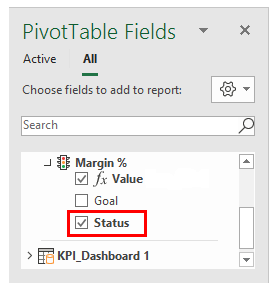
Step 19: Now, we can select icon style as well (These are the KPI Icons). I will opt out of the second style. As shown below.


Step 20: Click on the OK button once you are done with setting the KPI parameters and customization.


Now you know how to use Excel in getting KPIs.
Best wishes everybody!


Monday, February 21, 2022

Excel for Data Analysis: Using Autofill and Flash Fill


In this activity, you will use AutoFill and Flash Fill to complete the financial data workbook.

First, let’s use AutoFill to complete the formulas for the two profit columns. First, select cell G2 and place your cursor over the green AutoFill handle in the bottom right corner of the cell:


Then Click and drag it down to cell G20. This will copy the formula from G2 to all the blank cells, adjusting the cell references in the formula for each row:


Observe the results.

To extend the formula in column I, rather than clicking and dragging the AutoFill handle, simply double-click it. Note that Excel identifies the data pattern and copies the formulas to the end of the data in row 20:


Now, use Flash Fill to separate the City and Region data from column A into columns B and C. Click in cell B2 and type the City name from cell A2, “Quezon City”, then click in cell C2 and type the Region abbreviation “NCR”:


Now select cell B3, then click Data → Flash Fill:


Cells B2 through B20 now contain only the city name from column A. Now click cell 
C3 and click Data → Flash Fill to repeat the process for the Region abbreviations:


Observe the results.

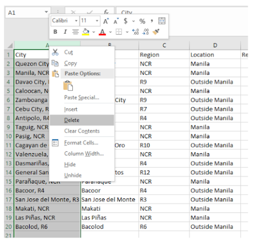
You can now discard the data in column A by right-clicking on the column header 
and selecting Delete from the menu:


The data in column A is removed and the remaining data shifts one column to the 
left. Note that the cell references in your formulas have changed to the new column 
letters automatically:


Get the Average Revenue.


Get the Highest Revenue.


Get the Lowest Revenue.


Friday, February 11, 2022

EXCEL FOR DATA ANALYSIS: USING CONCATENATE

 OBJECTIVE: CONCANTENATE THE ZIP CODE AND AREA OF QUEZON PROVINCE.

Two advanced functions in MS Excel related to the field of data science are concatenation and VLOOKUP. This blog is for CONCATENATE.

Concatenation Function

Use CONCATENATE, one of the text functions, to join two or more text strings into one string. This function is used to combine texts together and format them accordingly.

As a Data Analyst, we often deal with data when doing financial analysis. The data is not always structured for analysis and we often need to combine data from one or more cells into one cell or split data from one cell into different cells. The CONCATENATE function helps us to do that.

For example, consider the following dataset:


You were given only the Zip Code (Column B) and the Area (Column C) and your task is to write the name and zip code together with a space in the middle just like in Column A.

 Step 1.      Write the formula “CONCATENATE(B2, C2)” in cell D2.


2.      Pressing enter, the text would appear like this in Column D:

4300Quezon Provincial Capitol.

Therefore, we need to add a space in between.

3. Modify the formula in cell D2 as: =CONCATENATE(B2,” “,C2)

Where we have added a space string between the quotations.


4.      Pressing enter, the right format shows up.

 5. Lastly, fill flash the format in the following row as well to use the same format for the subsequent cells. The fill flash is performed by bringing the mouse icon in the bold right down corner of the selected box of cell D2 until a “plus” sign appears and drag it to cell D20.

Final Result:


Congratulations, now you know how to use CONCATENATE!


Thursday, February 10, 2022

DATA ANALYSIS USING EXCEL: APPLICATION NO. 1

DATA ANALYSIS USING EXCEL: APPLICATION NO. 1

Data science unifies computer science, machine learning and statistics in order to analyze a structured or an unstructured dataset. Data is an essential aspect in all fields of work, including banking, e-commerce, finance, healthcare, transport, manufacturing, and industrial processes, academia, and others. Excel is convenient for data entry, and for quickly manipulating rows and columns prior to statistical analysis. Analyzing the vast database requires special tools and techniques to manipulate the data in the most advantageous or preferred way. Before diving into the data analysis, it is important to learn about the basic statistical functions that are commonly used.

However, when you need to do statistical analysis of big data using statistical package such as SAS, SPSS, Stata, Systat , Minitab will still be the best choice.

But to those who can not buy costly statistical packages then  Excel is the default choice for analyzing data. It’s especially handy for making data analysis available to the average person at any organization.

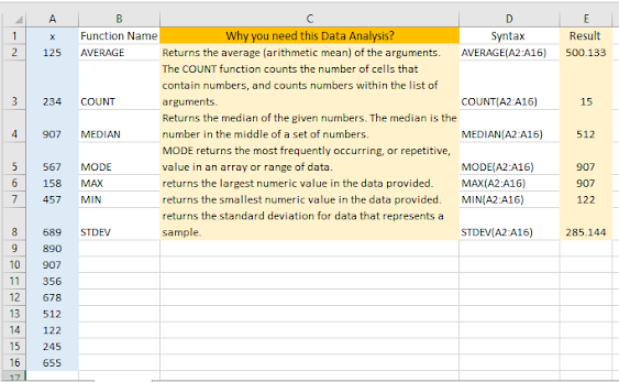
Let us analyze this data in blue color:


Figure above represents a dataset from the cells A2 to A16. From this dataset, compute the

AVERAGE (arithmetic mean), 

the COUNT (number of data), 

the MEDIAN (middle value of the dataset), 

the MODE (datum which appears the maximum number of times in the dataset), 

the MAX (maximum value),

the MIN (minimum value), and

the STDEV (standard deviation) functions are implemented, 

and the results are tabulated from cells E2 to E16. All these functions only need the range of the cells in which the data are placed to yield the result. With two rows of data, additional functions can be used to determine the relationship between two sets of data.

Figure below represents the use of the 

VAR, 

CORREL, 

PEARSON, 

KURT, 

SKEW,

SLOPE, and 

FORECAST functions upon two columns of data designated by x and y, respectively, representing array1 and array2 in the syntaxes of the functions.


Tuesday, February 8, 2022

Excel Data Cleaning Techniques: Change Text to Upper, Lower, or Proper Case


Unlike Microsoft Word, Microsoft Excel doesn't have a Change Case button for changing capitalization. However, we can use the UPPER, LOWER, or PROPER functions to automatically change the case of existing text to uppercase, lowercase, or proper case. Functions are just built-in formulas that are designed to accomplish specific tasks—in this case, converting text case.

The function UPPER(text) can change any text to Upper case.


Using the function LOWER(text), we can change any text to Lower case.


Using the function PROPER(text), we can change any text to Proper case.


Final result :