Friday, September 24, 2021

Data Analytics and Visualization using Tableau: Maps

 In Tableau, we can create maps that are useful in conducting geographic analysis. We need only to have a data source that contains locations with latitude and longitude.

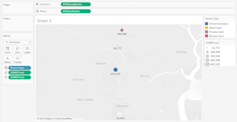
The objective is to create a map exactly like this below:


The raw data from http://insideairbnb.com/get-the-data.html is:


Step 1.Drag "Longitude" to Columns Shelf. Drag "Latitude" to Rows Shelf. Drag "Room Type" to color.


Step 2. Drag "Price" to "Size" and "Label". Drg "Neighborhood" to "Label". Since the data is aggregated, click on "Analysis" and unselect "Aggregate Measure".

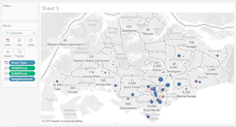
You now have a map of Airbnb in Singapore.

The Singapore map shows that Airbnb rents are concentrated in Southern Singapore specifically in the neighborhood of Kallang, Newton, River Valley, Downtown Core, and Outram. In terms of rental prices the highest can be found in the Orchard neighborhood and the lowest in the Kallang neighborhood. The most expensive private rooms are in the Orchard but the most inexpensive private rooms can be found in the Kallang neighborhood.

Arnel Lopez Cadeliña, MBA, RREA, CFA (Investment Foundation)
Tableau Author


Wednesday, September 22, 2021

Data Analytics and Visualization Using Tableau: Bump Chart

 The bump chart is one good line chart to show changes in the ranking of multiple items over time.

The objective is to create a bump chart similar below:


The data on Electronics export is shown below:

The Pivoted data:


Step 1. Drag the "Year" discrete to the columns shelf and "Million in Export" measure to the rows shelf then drag "Export" to color in the Marks. Then click "Sum (Million in Export) and select "Quick Table Calculation" - "Rank".


Step 2. Click "Sum (Millions in Export) and select " Compute using"- "Export".


Step 3. Press CNTRL and drag to drop " Sum (Millions of Export)" pill in the Rows shelf to the right. This will duplicate the object with all settings applied.


Step 4. Change to Circle the type of chart of the second "Sum (Millions in Export)". Click Label on Marks and then check "Show Mark Label" and adjust the alignment.


Step 5. Right-click the second pill "SUM (Millions in Export) " in Rows and select Dual Axis.


Step 6. In the second "Sum (Millions in Export) in the Marks card, Check "Show Mark Label" and align the circle in "Middle Center".


 Step 7. Hide the "Field Labels in Column", Remove Title under "Axis Title", check "Reverse" and check "None" under "Major Tick Marks". Rotate the Label.


The final Bump Chart is now shown.


If we look at the bump chart, the export fluctuated between 2010-2013 covering all export except transformers and resistors. Resistors were the top export from 2009 to 2017 but were overtaken by resistors from 2018 up to date. Transformers continue to be the sluggard in the exports of electronics ranking 7th from 2009-2020.


Arnel Lopez Cadeliña, MBA, RREA, CFA (Investment Foundation)

Tableau Author.


Wednesday, September 15, 2021

Data Analytics and Visualization Using Tableau: Bubble Chart

 The objective is to create a Bubble Chart to understand the three-way relationship of employment written exam score, interview score, and the chance of hiring if with Tableau skills.

The Bubble Chart to create is shown below:

The data is as follow:


Step 1. Drag the “Written Exam Score” to the columns shelf and “Chance of Hiring” to the Rows shelf. Then drag the “Tableau skills” to “Color” and drag the “Interview Score” to “Size” in the Marks. Select “Circle” in the Marks.

Step 2. Since the data is aggregated, click on “Analysis” and unselect “aggregate measures”.


Step 3.  To adjust the range of data in the X axis , right-click in the X-axis area, then select “Edit Axis”. In the pop up (Edit Axis [Written Exam Score], uncheck the box for “Include zero”.


Step 4. To adjust the bubble’s size and color opacity, click “Color” and “Size” in the Marks and change them as desired.

The Final Bubble Chart is shown below:


The bubble chart shows the higher the Written Exam score the higher the chance of hiring.  Also applicants with Tableau skills tended to have higher Written Exam Score and a higher chance of hiring than those who did not. It was found out that the higher Interview Score was also significant in the group with high Written Exam and high Chance of Hiring.

In summary, applicants with High Chance of Hiring show Excellent performance in Tableau, Written Exam and Interview.  


Sunday, September 12, 2021

DATA ANALYTICS AND VISUALIZATION USING TABLEAU: BOX PLOT

 The Data Analyst was requested by the Dean of a private university to analyze the students’ performance in “On-the-Job” training considering the evaluation of his/her company supervisor, his/her OJT teacher, and Written Assessment scores. The Dean said 5 out of 20 attended the OJT preparation summer course.

The goal is to analyze if the OJT preparation training helps in increasing students’ performance.

The objective is to create this Box-Plot:


The data is as follow:

Student Performance in OJT evaluation

OJT preparation course

Supervisor Evaluation

OJT Teacher Evaluation

Written Assessment scores

None

73

73

75

attended

70

91

89

None

91

96

94

None

55

57

55

None

77

79

76

None

72

84

79

attended

89

96

94

None

50

54

59

attended

65

65

68

None

48

61

51

None

59

55

53

None

41

53

44

None

66

82

74

attended

79

73

71

None

51

54

59

None

70

76

79

None

88

89

86

None

20

33

29

attended

47

43

47

None

55

59

62

 Step 1.  Drag the “OJT Preparation Course” and “Type of Assessment” into Columns and “Grades” into Columns.


Step 2. Since the data is aggregated, click on “Analysis” and unselect “Unaggregated Measures”. Select

     Box Plot chart type in the “Show Me” toolbar.


Step 3. Drag “Type of Assessment” into color in the Marks and select “Entire View” on the top toolbar.


Step 4. Final Box Plot is shown below.


Analysis:

The Box Plot shows students who took the OJT Preparation Training scored higher than those who did not. They get higher grades in the Supervisor evaluation and for Written Assessment those who attended the OJT preparation training were more clustered above the median.

In conclusion, students who took the OJT Preparation Training performed better in all types of assessment. 


Arnel Lopez Cadeliña, MBA, RREA, CFA (Investment Foundation)


Friday, September 10, 2021

Data Analytics and Visualization Using Tableau: Donut Chart

 The objective of this Tableau Project is to create a Donut Chart for Jollibee Sales. Donut Chart is a powerful visualization to show the proportion of individual categories in relation to the size of each piece in the chart.

The aim is to create a Donut Chart similar below:


 The sample data set:


Rank

Menu

Corporation

Global Sales

1

Yumburger

Jollibee

93.85

2

ChickenJoy

Jollibee

51.35

3

Jolly Spaghetti

Jollibee

46.93

4

Yumburger

Jollibee

44

5

Breakfast Shanghai

Jollibee

42.47

6

Breakfast Hotdog

Jollibee

41.37

7

ChickenJoy

Jollibee

41.12

8

Burger Steak

Jollibee

30.13

9

ChickenJoy

Jollibee

39.73

10

Palabok

Jollibee

35.87

11

Champ

Jollibee

34.53

12

Jolly Spaghetti

Jollibee

34.2

13

Breakfast Shanghai

Jollibee

33.83

14

Yumburger

Jollibee

33

15

Yumburger

Jollibee

22


Step 1. Select “Pie” shape under Marks. 

Step 2. Drag and drop “Menu” in Color , “Menu” in Label under Marks. Drag and drop “Global Sales” in Angle under Marks. Then change the view from  “Standard” to “Entire View”.


Step 3. Place the cursor on the blank space below the “Measure Values” on the screen’s left side and right-click “Create Calculated Field” then create a calculated field of 1.


Step 4. Drag and drop “Align Chart” in the Rows. Click and set “Measure” “Minimum”.

Step 5. Press Ctrl and drag and drop “Align Chart” fill to the right.

Step 6. Set the shape as Circle under the “Min (Align Chart) 2”. Remove all Pills under the Marks.

Step 7. Drag and drop “ Global Sales” to Label under Marks. Click Label then select and change the Label Alignment to Center.


Step 8. Change the Colors to white. Click the second Min (Align Chart) under Rows and set the “ Dual Axis” for the second Min (Align Chart).


Step 9. Click the Min (Align Chart) 1 under Marks then change the Size. This will change the pie chart’s size. Do the same step for Min (Align Chart) 2.


Step 10. Drag and drop “Global Sales” in Label of the pie chart Min (Align Chart). Click SUM (Global Sales) then Select “Percent of Total” under Quick Table Calculation.


Step 11. Right-click around the right axis and unselect Show Header. Do the necessary Title.

A final donut chart was made.


                                      ARNEL LOPEZ CADELI

Ñ

A
, MBA, RREA, CFA (Investment Foundation)