Friday, September 24, 2021

Data Analytics and Visualization using Tableau: Maps

 In Tableau, we can create maps that are useful in conducting geographic analysis. We need only to have a data source that contains locations with latitude and longitude.

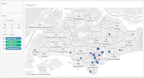
The objective is to create a map exactly like this below:


The raw data from http://insideairbnb.com/get-the-data.html is:


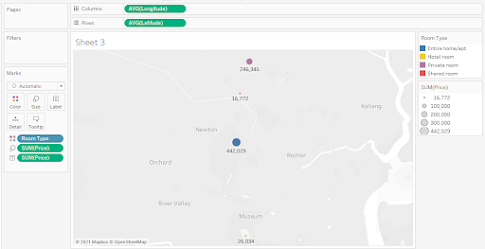
Step 1.Drag "Longitude" to Columns Shelf. Drag "Latitude" to Rows Shelf. Drag "Room Type" to color.


Step 2. Drag "Price" to "Size" and "Label". Drg "Neighborhood" to "Label". Since the data is aggregated, click on "Analysis" and unselect "Aggregate Measure".

You now have a map of Airbnb in Singapore.

The Singapore map shows that Airbnb rents are concentrated in Southern Singapore specifically in the neighborhood of Kallang, Newton, River Valley, Downtown Core, and Outram. In terms of rental prices the highest can be found in the Orchard neighborhood and the lowest in the Kallang neighborhood. The most expensive private rooms are in the Orchard but the most inexpensive private rooms can be found in the Kallang neighborhood.

Arnel Lopez Cadeliña, MBA, RREA, CFA (Investment Foundation)
Tableau Author


No comments:

Post a Comment