Saturday, January 23, 2021

CONNECTING TO YOUR FIRST DATA SET FOR TABLEAU PUBLIC: SAMPLE SUPERSTORE

<b>CONNECTING TO YOUR FIRST DATA SET FOR TABLEAU PUBLIC: SAMPLE SUPERSTORE</b>
Filipinos who downloaded the latest free version 2020.4 of Tableau Public will be given a copy of a data set called Sample Superstore. It can be found in your newly created My Tableau repository. The file location may vary depending on your operating system. On my laptop it can be found in my documents folder.
UNDERSTANDING THE SUPERSTORE DATA
Orders Tab.
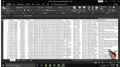
Looking at the Excel data, you can find in the at the bottom tabs that the file contains three sheets: Orders, People and Returns. The data, though not a real company, is close to what is happening in a business. The three sheets are related to one another that in your visualization the three data can be utilized and create a visualization that complementing each other.
People Tab.
Returns Tab.
Opening the Superstore Excel File
When you open your Tableau Public the screen will look like this:
On the left blue side, you connect to Microsoft Excel then find the Sample Superstore file saved in your Documents Folder. Step 1. Click Open then the data source page appears.
Step 2. Drag and drop the Orders Sheet onto the top space with word “drag tables here”. Tableau will now give you the preview of data for Orders.
Step 3. Click the orange- colored tab “Sheet 1”. This is now your first Tableau Worksheet.
But before you create your first visualization you have to be familiar first of your Tableau Workspace.
Workbook (1). This is the workbook title, which is the name given to the workbook when you save it. Toolbar (2). This is where you can save your work, among other functions. Cards and Shelves (3). These are the areas where you can add fields or filters to the visualization. The View (4). This is where your graph or visualization will appear. The Show Me card (5). This prompts you to create different visualization types based on the data selected. Sheet tabs (6). This allows you to create, rename, or duplicate sheets. Status bar (7). This shows the aggregated totals of the marks on your visualization. The Sidebar (8). This contains both the Data window and the Analytics pane. The Start button (9). This takes you back to the home screen.
Arnel Lopez Cadelina
Next Blog: The Menu Bar .

Friday, January 22, 2021

CONNECTING YOUR DATA TO TABLEAU

CONNECTING YOUR DATA TO TABLEAU Beginners in Tableau will be surprise to hear repeatedly the word dirty and clean. The first time I heard dirty was in a Tableau Conference in which I interpreted it as related to money laundering being exposed to Finance for two decades. I was dead wrong! When data analysts say dirty it means the data is dirty. It is a sexy description of data that are unfit for analysis and visualization. So, if it is dirty you need to clean it first before connecting your data to Tableau.
In Tableau you have to remember it works with data where it was saved, whether it’s in a database, files, or even in the cloud. In Tableau Public you can connect to a file and to a server. You can see it on the left side of the Tableau Public page.
Comparing it to the paid version Tableau Desktop it has limitation in terms of connecting to data sources.
Money changes everything. If you upgrade to the paid version, you will access on hundreds of data sources such as : Actian Matrix, Actian Vector, Alibaba AnalyticDB for MySQL, Alibaba Data Lake Analytics, Alibaba MaxCompute, Amazon Athena, Amazon Aurora, Amazon Elastic MapReduce, Amazon Redshift, Anaplan, Apache Drill, Aster Database, Box, Cloudera Hadoop Hive, Cloudera Impala, Databricks, DataStax Enterprise, Denodo, Dropbox, Esri ArcGIS Server, Exasol, Firebird, GeoJSON, Google Ads, Google Analytics, Google BigQuery, Google Cloud SQL, Google Sheets, Hortonworks Hadoop , Hive, HP Vertica, IBM BigInsights, IBM DB2, IBM PDA, Impala, JSON files, KML files, Kognitio, Kyvos, LinkedIn Sales Navigator, MapInfo Interchange Formats, MapInfo Tables, MapR Hadoop Hive, MariaDB, Marketo, MarkLogic, MemSQL, Microsoft Access, Microsoft Analysis Services, Microsoft Azure Data Warehouse, Microsoft Azure DB, Microsoft Excel, Microsoft OneDrive, Microsoft PowerPivot, Microsoft SharePoint Lists, Microsoft Spark on HDInsight, Microsoft SQL Server, Microsoft SQL Server PDW, MonetDB, MongoDB, MongoDB BI, MySQL, OData, Oracle, Oracle Eloqua, Oracle Essbase, PDF files, Pivotal Greenplum Database, PostgreSQL, Presto, Progress OpenEdge, Qubole, Quickbooks Online, R files, Salesforce.com, including Force.com and Database.com, SAP BW, SAP HANA, SAP Sybase ASE, SAP Sybase IQ, SAS Files, ServiceNow ITSM, Snowflake, Spark SQL, Splunk, SPSS Files, Tableau Data Extract, Teradata, Teradata OLAP Connector, TIBCO® Data Virtualization, Text files—comma separated value (.csv) files, Databases and applications that are ODBC 3.0 compliant* and Tons of web data with the Web Data Connector.
But since we are into the free Tableau Public, you can see below the limitation:
You will notice on the left blue side, the Microsoft Excel on the top. Tableau knows that millions of people in the planet use Microsoft Excel in their data preparation and analysis. That is why being widely used, let us start how to make your Excel data in the correct format for Tableau. In short let us start cleaning your data.
Familiar isn’t it?. All over the Philippine, those who are using MS Excel this is a data that is formatted in a crosstab format and the table is column oriented where variables are stored as column headers. A common mistake for Tableau beginners, just like I did, is to connect to Tableau using the above format. This will not get you very far and will not create your desired visualizations. You have to clean the data by converting it to row-oriented table where the variables are stored in the row values.
Tableau Public in short is optimized to connect to row-oriented tables
and you can pivot the columns in the rows, by manually editing your Excel data. Alternatively, you may connect to your Excel data from Tableau Public and then use the pivot option. The clean data now ready for Tableau Public should look like this:
Now you are ready to open and upload your clean MS Excel data in the Tableau Public tool to begin visualising the data you have prepared. Enjoy your cleaning of data!.
Arnel Lopez Cadelina
Next Blog: THE SAMPLE DATASET.

Wednesday, January 20, 2021

DOWNLOADING TABLEAU PUBLIC

DOWNLOADING TABLEAU PUBLIC In 2016 I obtained a CHED scholarship and studied “Enterprise-Wide Risk Management” at Asian Institute of Management.
In one of the session, the professor sounded an alarm that slow internet connectivity in the country affects the GDP and access should be considered a basic need of Filipinos. He added, everyone should enjoy their rights to freedom of expression and world class education thru Massive Open Online Courses.
Downloading free software then, such as Tableau Public, is a right.
Filipinos know internet connectivity in the country lags behind among those of contemporary developing countries in Asia. According to Kathleen de Villa in her July 28, 2020 PDI article “In the Know: Internet in PH” there are some 57 million internet users, 3.9 million broadband subscribers and 134.6 million mobile phone subscribers. Downloading free software, such as Tableau, in a quick manner is confined only as of the moment to those broadband users. The number will still go down if we will dissect it and see who are really users of Tableau. The good news is the DICT announces that Filipinos are now experiencing significant internet speed of 25.07 mbps for fixed broadband. Now that you have insights of how our internet connectivity works, let us download the grandmaster of all data visualization software.
Step 1: Type ‘Tableau Public’ in Google.
Step 2: Provide an e-mail address
It is a must that you have an e-mail address and once you enter your own email address an “exe” file will download Tableau Public automatically on your computer.
Step 3: Install
Open the “exe” file, agree to Tableau’s terms and conditions, click run and then click install. This is the standard installation procedure in downloading Tableau Public.
Step 4: Smile
because now you have in your PC or Mac the Tableau Public software and you are now part of the passionate Tableau Community.
Arnel Lopez Cadelina

Monday, January 18, 2021

MY PERSONAL TABLEAU STORY

MY PERSONAL TABLEAU STORY I first came across Tableau in 2018 when I was attending a Business Analytics seminar at the University of the Philippines Institute for Small Scale Industries. The trainer, Dr. Eduardo Canela, enlightened me on the advantages of a modern analytics platform. Me being an Excel guy never thought that there is an available tool that can be easily use graphical interface, create data stories and interactive dashboards. I hang on every word of Dr. Canela as he demonstrated on dragging measures and dimensions onto the Tableau canvas. Now I can create different charts in minutes in what used to take me hours. I turned into a Tableau fan.
THE TABLEAU APPLICATION SUITE 
Filipinos who are not familiar with the different Tableau products will be impressed by the market-leading choice for modern business intelligence. Tableau support the full cycle of self-service analytics from prep to analysis to sharing, with governance and data management every step of the way. Here is the quick overview culled from Tableau.com: 
Tableau Prep provides a visual and direct way to combine, shape, and clean data, as well as automate data prep flows, helping you get to analysis and insights faster. 

Tableau Desktop called “the gold standard” in visual analytics offers unlimited data exploration through an intuitive interface, encouraging curiosity, creativity, and data-driven decision-making.

 
Tableau Server You can extend the value of your data across your entire organization with on-premises. Intended for organization-wide provision of data visualizations and dashboards. 

 Tableau Online is your answer to hosted self-service analytics in the cloud—it’s secure, scalable, and removes your need to manage servers. No purchase and maintenance of server. 

 Tableau Mobile app for iOS and Android Empower for data-driven decisions anytime, anywhere. With the Tableau Mobile app for iOS and Android, you can access and monitor your most important dashboards and KPIs on the go. 

Tableau Public is a free platform to publicly share and explore data visualizations online. Anyone can create visualizations using this free Public Edition. 

Tableau Reader is a free desktop application that you can use to open and interact with data visualizations built in Tableau Desktop. Filter, drill down and discover.

INSTALLING TABLEAU DESKTOP 
Filipinos who would like to participate in any Tableau Public Training need to install the latest version 2020.4 Tableau Public. Released last December 14, 2020 the Tableau 2020.4 brings practical enhancements to make analytics in an organization more seamless and scalable.

SYSTEM REQUIREMENTS FOR TABLEAU DESKTOP AND TABLEAU PUBLIC 
As long as you have a PC running Microsoft Windows 7 or later (64 bit) or a Mac that's no more than four years old and running OS X 10.10 or later, you should be able to run Tableau Public. These are the official minimum requirements for a Windows installation: 
• Microsoft Windows 7 or newer (x64)
• 2 GB memory
 • 1.5 GB minimum free disk space
 • CPUs must support SSE4.2 and POPCNT instruction sets.
 These are the official minimum requirements for a Mac installation 
• macOS High Sierra 10.13, macOS Mojave 10.14 and macOS Catalina 10.15
• Intel processors
• 1.5 GB minimum free disk space
• CPUs must support SSE4.2 and POPCNT instruction sets

Saturday, January 16, 2021

THE CHICKEN JOY FOR THE DATA ANALYST BRAIN

The Chicken Joy for the Data Analyst Brain The number one fast food in the Philippines, Jollibee, was ranked fourth in the Best Fast-Food Fried Chicken list released by American Magazine Redbook, surpassing other U.S. fast-food giants like Shake Shack, McDonald’s, and KFC (Quadra,2020). The top selling Jollibee Chickenjoy made it to top 3 in America’s best fast-food fried chicken list released by FoodBeast in the United States.
Filipinos who are joyful in the success of Jollibee Chicken Joy can also be at the forefront in the self-service data analytics by reading these Top 10 Chicken Joy (books) for the Data Analysts Brain . I read the ten books and learned from the authors who enjoy doing data visualization and data analysis. Filipino data analysts and data enthusiasts will enjoy reading them also while munching their Jollibee Chicken Joy, Spaghetti, Peach Mango Pie and Halo-Halo. The list are my personal choices but other Tableau wizards who are better than me may find it odd with their own choices but that is the beauty of reading. We digest but tasted it differently. My top 10 are: 10. Effective Data Storytelling: How to Drive Change with Data, Narrative and Visuals by Brent Dykes.
is a good book for anyone who communicates regularly with data, including business professionals, analysts, marketers, salespeople, financial managers, and educators. Effective Data Storytelling will teach you the essential skills necessary to communicate your insights through persuasive and memorable data stories. 9. Steal Like an Artist: 10 Things Nobody Told You About Being Creative by Austin Kleon.
Hold your horses before you judge based on your religious views. Austin will share to you that you don’t need to be a genius, you just need to be yourself. The book is a manifesto for the digital age giving the readers positive messages, graphic look and illustrations, exercises, and examples that will put your artistic side on fire. 8. Info We Trust by RJ Andrews.
When I read this book it touches my human experience, my quantitative skills and poetic inclinations. RJ Andrews teaches advanced techniques, such as visual metaphor and data transformations, in order to create more human presentations of data. His book is lavishly illustrated with hundreds of original compositions designed to illuminate the craft, delight the reader, and inspire a generation of data storytellers. 7. Data Visualization Made Simple by Kristen Sosulski.
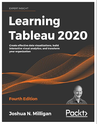
This book will give the reader a practical guide to the fundamentals, strategies, and real-world cases for data visualization. Beginners in Tableau from education, business, and other areas can use this book’s effective, linear process to develop data visualization literacy and promote exploratory, inquiry-based approaches to visualization problems. 6. Learning Tableau 2020 by Joshua Milligan.
Prolific author who lavishly shares useful tips and tricks. Joshua will teach you to tell data stories using dashboards and guide you how to share these data stories. Rich with practical examples along with detailed explanations will make your learning enjoyable. 5. Fundamentals of Data Visualization: A Primer on Making Informative and Compelling Figures by Claus Wilke.
If you want to learn the elements most critical to successful data visualization then this is your book. You will be delighted with many commonly encountered visualization problems and will know how to turn large datasets into clear and compelling figures. Author Claus O. Wilke is the best to teach you what visualization type is best for the story you want to tell and how do you make informative figures that are visually pleasing. 4. Data Visualisation: A Handbook for Data Driven Design by Andy Kirk.
If you want to absorb years of data visualization experience by hands on practice of curated collection of classic and contemporary examples then this book is for you. Examples on every page, illustrations of good and bad practices, loads of online practical help, checklists, case studies and exercises make this the most comprehensive text available. 3. Visual Analytics by Alexander Loth.
Those who are not in IT or Computer Science will find this book in Tableau a complete journey. You may start with zero knowledge, connect your Excel in your first Tableau data, and get right into creating insightful dashboards. Without a doubt, this book makes it easy and approachable to get started right away. 2. Pro Tableau a Step by Step Guide by Seema Acharya, Subhashini Chellappan.
If you not a beginner in Tableau and want to level up then this book is for you. Fit for those who are teaching Tableau in graduate school and in college. The book will help those familiar with Tableau software chart their journey to a visualization expert. 1. The Big Book of Dashboard. Steve Wexler, Jeffrey Shafter, Andy Cotgreave.
The best Chicken Joy for our Filipino Brain is this book. Combining more than 30 years hands-on experience of the authors helping people in hundreds of organizations build effective visualizations. They know the 'best practices' in data visualizations and their book presents a comprehensive reference for those preparing business dashboards. Peppered with examples focusing on different industries and departments The Big Book of Dashboards is the only book that matches great dashboards with real-world business scenarios. There are other data analytics and data visualization books out there that maybe better than my 10 choices. Readers will be happy if you include them in the list. Enjoy your Chicken Joy for the Data Analyst Brain!. Arnel Lopez Cadelina

Hey Data Visualization!

Hey Data Visualization! Data Visualization is not new. Claudius Ptolemy used a table of astronomical information in around 150 CE Egypt, RenĂ© Descartes made a method of presenting number-based data using 2-D coordinate scales later became known as the Cartesian coordinate system in the 17th century, William Playfair made the 19th century exciting by inventing time-series line graph, bar chart, and pie chart while Charles Minard created the “best statistical graphic ever drawn which is the Map of Napoleon’s Russian campaign.
In the 20th century, data visualization became an exciting fields due to cartography of Jacques Bertin, scatter plot of John Tukey, combining beautiful statistics and visualization by Edward Tufte, trellis chart of William Cleveland and thank God for Stephen Few whose book "Show me the Numbers" still considered as the mother of all data visualization books.
Today we areed on Claus O. Wilke when he said that " analyst, consultant, or anybody else who has to prepare technical documents or reports, one of the most important skills you need to have is the ability to make compelling data visualizations". But what is really data visualization?. Data visualization is part art and part science. A process of representing information graphically where we can see relationships, patterns, outliers, similarities, and differences. The ability to convey accurate information as the primary driver of the design of a visual make the findings stand out. Aesthetically pleasing good visual presentations tend to enhance the message of the visualization. With data all around us spurred by the internet we can accurately say we live in a data-driven world and in this world the ability to create charts and graphs is a huge important skill in this century.
Analysts at Gartner predict that by 2025, we will get most of our information from data-driven narrative storytelling, and 75% of these stories will be generated by automated systems. If data visualization is a skill, how can you learn it?. There are 20 data visualization tools available in the market. In May 22, 2020 Forbes identified "The 9 Best Analytics Tools For Data Visualization Available Today". The top spot belongs to Microsoft Power BI and Tableau. Both offers useful and intuitive data visualization functionality but I am inclined to used Tableau because it is the grandmaster of enterprise data visualization tools. Using it gives the user the power and flexibility when it comes to generating graphical representations of data. But foremost reasons of embracing Tableau are the free version Tableau Public, the active Tableau Community and the support for academics like me. Founded only in 2003. Tableau is a groundbreaking data visualization software. It seamlessly connects to almost any data source -- Excel, Text File, JSON File other local files, databases (MySQL, PostgreSQL etc.), on the cloud (Amazon, Azure etc.) or any of the supported web services (Google Analytics and more).
Why we should use Tableau? Companies now are positioning their employees to use self-service analytics. The pandemic is now forcing employers not to rely 100% to their IT team and rather see their employees to use a highly accessible and simple business intelligence tool such as Tableau. The Chief Economist at Google Hal Varian
beautifully said "the ability to take data - to be able to understand it, to process it, to extract value from it, to visualize it, to communicate it- that's going to be a hugely important skill in the next decades". But what can Tableau basically do in order for us to create a compelling data visualization?. Here is the summary:
The basic charts are good but Tableau can deliver more by tapping the creativity in you. You can create storytelling charts and put it in a dashboard.