Written by data4goodph to expose you to the data analytics practices executed in the business world. Topics discussed explore such key areas as the analytical process, how data is created, stored, accessed, and how the organization works with data and creates the environment in which analytics, AI and financial modeling can flourish. The aim is to develop skills and allow you to become a valuable asset to your organization.
Saturday, January 29, 2022
Tuesday, January 25, 2022
EXCEL: Computing Production Order Quantity (PROQ)
In the ECONOMIC Order Quantity the whole inventory order was placed at one time, instantaneously raising the stock levels. This situation is typical of wholesalers who operate with large inventories, large quantities, and large turnovers. However in a manufacturing environment, the situation is somewhat different. If a firm’s rate of production is greater than its customer demand, the firm can meet its customers’ inventory requirements on an ongoing basis, while also building up an inventory from surplus stock. When this surplus inventory becomes large enough to meet customer demands for a reasonable period of time, production of the item can stop until all excess stock has been used up. On the other hand, if the production rate falls below customer demand, there will be no surplus goods, and some customer orders may not be fully met.
The production order quantity (PROQ) model differs only from the EOQ model in that replenishment is not instantaneous, otherwise the same conditions hold, i.e.,
A single item is considered.
All costs are known exactly and do not vary.
No shortages (stockouts) are allowed.
Let us have one example:
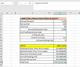
The CADELINA Company manufactures AUTOPARTS with an annual demand of 2100 units. The AUTOPART is manufactured at a rate of 2500 units per year. Unit cost for an autopart is P30, setup cost is P450, and the annual holding cost is 20% of its value. Using the formula template provided at the bottom , create the Production order quantity (PROQ) model, and hence find the optimal batch size, cycle time, and total cost for an Autopart (see cells E12:E18).
Sunday, January 16, 2022
EXCEL GRAPHING AND CHARTING: BAR CHART DATA SOURCE BOX
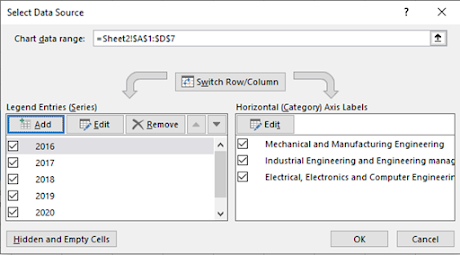
Data Source boxes are used to manipulate the data, chart, format the axis, and for many other important tasks. To find the dialog box Select Data Source to switch axes, select the chart and follow this process:
1. Right-click > Select Data.
The dialog box “Select
Data Source” pops up.
2. On the left, the
three data series of three departments are shown. On the right, the
3. If Switch Row/Column is clicked, there will be five data series (2016, 2017,2018, 2019, and 2020) and three horizontal axis labels (three departments ).
Result:
You may change the style
of your Bar Chart by clicking “Style”
Saturday, January 15, 2022
EXCEL: FORECASTING SALES, COST AND PROFIT
EXCEL: FORECASTING SALES, COST, AND PROFIT
Amiel M. Cadeliña
At Mapua University we have Engineering Economics and in Sacred Heart College they have Business Analytics and both tackle company’s supply chain. Both schools give exercises where Excel records are the source data. In this example, we tackle a record in Excel of a company’s sales results. In this pandemic time, many small and medium enterprises are facing difficulty and some of them closed their operation. The objective of this post is to help these small and medium enterprises do forecasting of their Sales, Cost, and Profit using Excel. Learning it may help them fix what’s gone wrong.
In the Figure below, fictitious data on Consumer and
Non-Consumer Electronics is given. The figure shows the actual revenue and the
actual direct costs of supporting each product line during each month from
January 2019 through July 2021, in row 3 through row 33. The worksheet gets the
profit figures simply by subtracting the costs from the revenues.
I’m using
exponential smoothing for costs, and regression for revenues, simply to
illustrate the methods.
Steps in
doing the forecast:
Compute exponential
smoothing.
1. In cell P4 type =C3
2. In cell P5 type =$P$1*C4+$P$2*P4
3. Drag the P5 cell downward up cell P33
4. In cell P35 type = $P$1*C33+$P$2*P33
5. Forecast Revenue of Consumer electronics, in cell A35 type Forecast for August 2021.
6. Then in cell B35, type =TREND(B3:B33,C3:C33,C35)
7. Then in cell C35, type your result in number 4 by typing =P35
8. Then in cell D35, type =B35-C35
Result
You now made a Revenue, Cost, and Profit Forecast. Congratulations!
Thursday, January 13, 2022
EXCEL GRAPHING AND CHARTING: BAR CHARTS
Bar charts can compare values of different categories by the use of adjacent vertical bars. Like line charts, bar charts in Excel can also be represented in 2D or 3D Line, each having three categories: stacked column, clustered column, and 100% stacked column.
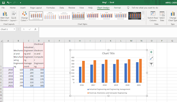
From the previous example, we want to create a clustered column chart for the Mapua students of Mechanical and Manufacturing Engineering and Electrical, Electronics, and Computer Engineering. We see that the Year data and the student’s data are not adjacent. To create the chart in this case, implement the following steps:
Select the cells A1:A7. Press and hold CTRL. Select the cells C1:C7 and then D1:D7, and let go of CTRL.
-
The Gift of Clarity: How a New SSS Pension Calculator and Custom SSS GPT Empowers Every Filipino Worker In the labyrinth of retirement plann...
-
Why 17 Financial Ratios Matter for Philippine SMEs In the fast-moving world of small and medium enterprises (SMEs), gut instinct and grit ...


