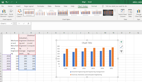
Bar charts can compare values of different categories by the use of adjacent vertical bars. Like line charts, bar charts in Excel can also be represented in 2D or 3D Line, each having three categories: stacked column, clustered column, and 100% stacked column.
From the previous example, we want to create a clustered column chart for the Mapua students of Mechanical and Manufacturing Engineering and Electrical, Electronics, and Computer Engineering. We see that the Year data and the student’s data are not adjacent. To create the chart in this case, implement the following steps:
Select the cells A1:A7. Press and hold CTRL. Select the cells C1:C7 and then D1:D7, and let go of CTRL.


No comments:
Post a Comment