Written by data4goodph to expose you to the data analytics practices executed in the business world. Topics discussed explore such key areas as the analytical process, how data is created, stored, accessed, and how the organization works with data and creates the environment in which analytics, AI and financial modeling can flourish.
The aim is to develop skills and allow you to become a valuable asset to your organization.
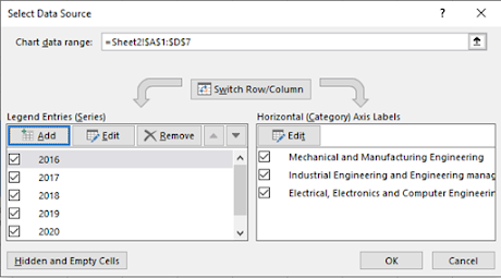
Data Source boxes are used to
manipulate the data, chart, format the axis, and for many other important
tasks. To find the dialog box Select Data Source to switch axes, select the
chart and follow this process:
1. Right-click > Select Data.
The dialog box “Select
Data Source” pops up.
2. On the left, the
three data series of three departments are shown. On the right, the horizontal axis labels
are shown.
3. If Switch Row/Column
is clicked, there will be five data series (2016, 2017,2018, 2019, and 2020)
and three horizontal axis labels (three departments ).
Result:
You may change the style
of your Bar Chart by clicking “Style”
At Mapua University we have Engineering Economics and in
Sacred Heart College they have Business Analytics and both tackle company’s supply
chain. Both schools give exercises where Excel records are the source data. In
this example, we tackle a record in Excel of a company’s sales results. In this
pandemic time, many small and medium enterprises are facing difficulty and some
of them closed their operation. The objective of this post is to help these
small and medium enterprises do forecasting of their Sales, Cost, and Profit
using Excel. Learning it may help them fix what’s gone wrong.
In the Figure below, fictitious data on Consumer and
Non-Consumer Electronics is given. The figure shows the actual revenue and the
actual direct costs of supporting each product line during each month from
January 2019 through July 2021, in row 3 through row 33. The worksheet gets the
profit figures simply by subtracting the costs from the revenues.
I’m using
exponential smoothing for costs, and regression for revenues, simply to
illustrate the methods.
Steps in
doing the forecast:
Compute exponential
smoothing.
1.In cell P4 type =C3
2. In cell P5 type =$P$1*C4+$P$2*P4
3. Drag the P5 cell downward up cell P33
4. In cell P35 type = $P$1*C33+$P$2*P33
5.Forecast Revenue of Consumer electronics, in cell A35 type Forecast for August 2021.
6. Then in cell B35, type =TREND(B3:B33,C3:C33,C35)
7. Then in cell C35, type your result in
number 4 by typing =P35
8. Then in cell D35, type =B35-C35
Result
You now made a Revenue, Cost, and Profit Forecast. Congratulations!
Bar charts can compare values of different categories by the use of adjacent vertical bars. Like line charts, bar charts in Excel can also be represented in 2D or 3D Line, each having three categories: stacked column, clustered column, and 100% stacked column.
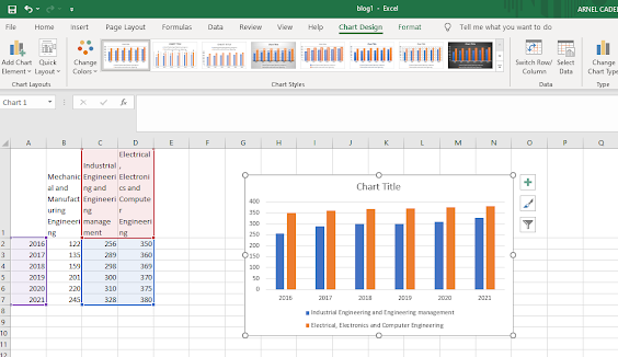
From the previous example, we want to create a clustered column chart for the Mapua students of Mechanical and Manufacturing Engineering and Electrical, Electronics, and Computer Engineering. We see that the Year data and the student’s data are not adjacent. To create the chart in this case, implement the following steps:
Select the cells A1:A7. Press and hold CTRL. Select the cells C1:C7 and then D1:D7, and let go of CTRL.
Click Clustered Column.
Result:
The style of the graph and the color of the charts can be changed from the following
ribbon (can be opened by “Chart Tool>Design” while the Chart is on the screen).
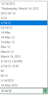
The format of the axes can be changed from text axis to date axis in case the date needed to be presented in the horizontal axis is not in sequential order. Even though Excel automatically selects the text or date axis, sometimes it may be required to change the type manually. This rule is not applicable for dates in legend. For the following dataset:
After plotting the line chart, this should look like the following for the text axis:
Format the Axis, click Text Axis and select 3/14/12
This function is available for line charts, area charts, bar charts, and column charts.
LINE CHARTS: AXIS TITLE
For adding a title on the vertical axis, select the chart and follow these steps:
1. Clicking on the + button beside the chart, select Axis Titles > Primary Vertical.
Give a suitable title to the vertical axis. For the above example, the title is changed to “Produced Items”
You may change the Chart Design by using the "Chart Design" button to make it more appealing to the viewers.
LINE CHARTS: AXIS SCALES
The values of the vertical axis are automatically determined by Excel. To manually
alter these values, follow this process:
1. Right-click on the vertical axis. Click on Format Axis. Then the Format Axis
pane pops up.
Set the Maximum = 1000 for the bound and Major = 100 for the units.
Result:
LINE CHARTS: ERROR BARS
The following example shows the method of adding error bars to a line chart in
Excel. Consider the following data:
Select Insert > Line chart. The line chart will look like this:
From the + button beside the chart, go to Error Bars > More Options.
There is a shortcut to display error bars using the Standard Error, which shows a percentage value of 5% or one standard deviation.
Line charts
present the change of data with time. We commonly call them graphs. A line
chart is used to insert numeric labels, text labels, or time stamps on the
horizontal axis. Line charts may be two or three-dimensional.
Let us have
a project to do it. Suppose a dataset for the engineering students getting
admitted to Mapua University is as follows:
Step 1. Go
to Insert > Charts. Select the “Insert Line Chart” symbol.
Step 2. There are several options available. To show
the change in trend with markers, click “Line
with Markers.”
Result:
Note: Ensure
that the “year” in cell A1 is excluded.
Tip: In Excel , you can change the Line Chart
design by using the “Quick Layout”.
I have been using Tableau for 5 years now but Excel has been part of my work for more than 30 years way before sophisticated Business Intelligence tools like Power BI and my favorite BI tool Tableau. Companies and people trust Excel and even though Tableau can do more in Data Visualization there are more people familiar and comfortable with Excel. So, In this post, we will learn the use of Excel for data analysis.
In all companies I worked with, Excel as a spreadsheet is used for many internal applications. We use it to budget, timeline projects, create simple dashboards, and even for project management. Simply said Excel is used to fulfill a specific need by consolidating data points and creating a cohesive narrative for data analysis.
The improvement of Excel in their almost yearly versions made the fundamental goal of data analysis easier to learn and understand the data and derive meaningful, actionable insights. Most of all Excel is affordable and widely used.
First feature: Pivot Tables
Pivot tables are used to quickly group, aggregate, filter, and visualize data with simple drag and drop. No formula is needed. A pivot table in Excel is an extraction or resumé of your original table with source data. A pivot table can provide quick answers to questions about your table that can otherwise only be answered by complicated formulas. Pivoting tables are easy to change on the need of the data analyst since the pivoting draws attention to valuable information, which is fundamental to data analysis. A simple refresh will update all values when new data is added to the table you are analyzing.
Pivot Analysis
Analyze Data
This feature helps Data Analysts understand the data using a natural query language without writing complex formulas. Visualizations are displayed for a query using the best suitable chart.
‘Analyze Data’ can also be accessed under the Home tab.
Analyze Data
Analysis Toolpak
The Analysis ToolPak is a Microsoft Excel add-in program.It is a free add-on used to perform complex statistical or complex engineering analyses. To use it in Excel 2013 or Excel 2016, you need to load it first:
From Excel 2013 or Excel 2016, click the File tab, and then click Options.
Click Add-Ins and in the Manage box, select Excel Add-ins.
Click Go… button.
In the Add-Ins available: box, select the Analysis ToolPak check box, and then click OK.
After you load the Analysis ToolPak, the Data Analysis command is available in the Analysis group on the Data tab.
There are numerous functions like correlation, descriptive statistics, smoothing, histogram, moving average, rank, regression, etc.
Analysis ToolpakPower Query (Get & Transform)
Excel add-in can be used for data discovery, cleansing, transforming, and combining data from different sources. It prepares data for further analysis. In this image, you can see Returns2. Returned is a column from another table.
Power Query
Other Useful Excel Features to Analyze Data
Sort
You can sort data on multiple columns for analysis. In this example, since Salary is sorted in descending order within State sorted alphabetically. So, we can now compare data state-wise and salary-wise.
SortFilter
A Filter not only allows you to select data but also shows you the unique values, blank values if any.
Filter in data analysis using excel
Functions
Excel has many functions that help in data cleaning, sorting, analysis, and much more. Some common examples are:
Function
Use
Syntax
COUNTBLANK()
Detect missing values and will give the count of blanks.
COUNTBLANK(range)
CONCATENATE()
Combine the values of several cells into one cell.
Replace the #VALUE errors with any text/value. Useful when displaying data to the end-user.
IFERROR(value, value_if_error)
Functions in data analysis using ExcelConditional Formatting
Since, You can visualize data using data bars, color variations, and icon sets depending on the cell’s value. In this figure, you can see some options and data bars. When you have large amounts of data, this is helpful to emphasize unusual values and identify patterns.
For instance, You can use the built-in conditions or create your own. So, You can apply conditional formatting to a selected range of cells, an Excel table, or a pivot table.
Conditional FormattingRemove Duplicates
You have the option in Data -> Remove Duplicates, and we can also choose the column names that we want to check for duplicate values. It is an essential task in data cleaning.
Remove DuplicatesCharts
Creating data visualizations is very easy using Excel. Analyzing rows and rows of data is much easier with a chart! Excel provides a variety of charts for your analysis.
ChartsDifferent Kinds of Data Analysis Using Exceltypes of data analysis using ExcelTables
Excel tables also help to manage and analyze datasets systematically with headers and alternate shading or banding of rows. since, They have structured references and dynamic ranges, which aid in data analysis. so, You can convert data in Excel to a table by clicking any cell in the data and Ctrl + T.
What-if Analysis
What-If Analysis in Excel allows you in order to compare the outcome results based on variable changes. So, The goal seek functionality helps by mathematically adjusting a single variable to reach the desired goal, and there are many other features. This option is in the Data tab.
Final Remarks
Python and R, Tableau, and Power BI are other tools for data analysis but I embraced that Excel is still relevant because it is easily available for many people. Many students and professionals use Excel as their first tool for their spreadsheet and by default the first in one's journey in business data analytics.